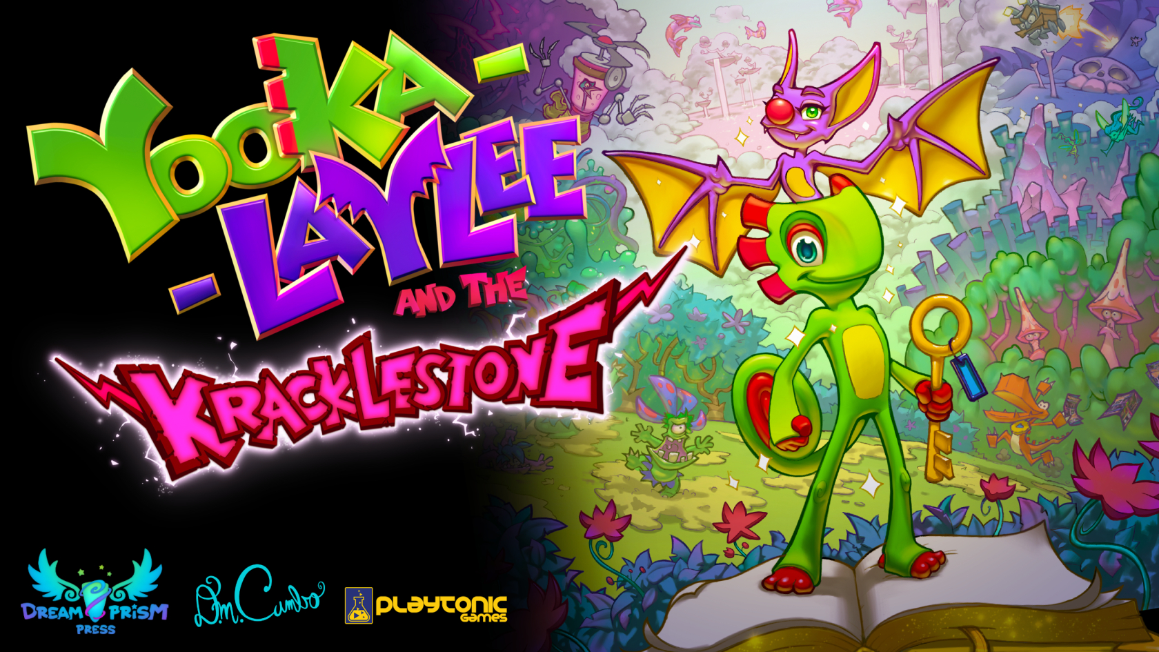
A brand new graphic novel based on the characters and world of Yooka-Laylee! NOTE: All prices are in US dollars.
Latest Updates from Our Project:
Project update with LOADS of pics!
over 4 years ago
– Sat, Jan 04, 2020 at 09:55:15 PM
Hey Backers!
This is my biggest update so far... I hope you've prepared at least two cups of coffee!
You've probably noticed you're not holding a copy of Kracklestone at the moment. Why? Unfortunately, the book printing is taking quite a bit longer than initially estimated. It's a seriously complicated job for the printers who are a bit overwhelmed with the project complexity. Hopefully all the gorgeous pics in this update will explain why the wait is gonna be totally worth it and we'll all be glad the extra time was taken.
First, here's a list of some of the challenges faced over the past month or two:
The creative work on the book was finished around mid-November and submitted to vendors for production. The first step is proofing to ensure everything looks good on paper. See below for pics!
The holiday season was bad timing. Everything shuts down between Thanksgiving and Christmas. For some reason, my protests of "Bah!" and "Humbug!" fell on deaf (absent, actually) ears.
The plant continually sent incorrect files that had to be re-proofed. This book has four variations (standard, backer, standard/ribbon, and backer/ribbon). Every time I received a file with errors, it added about a week to get things fixed and sent back to me. Communication was painfully slow. This is not to mention the amount of creative fixes I had to make to improve the art's appearance on paper. Lesson learned: DO NOT submit a job during the Christmas season!
Good news! As of yesterday, everything has finally been approved and the books are off to the press! The plant has not been able to confirm delivery dates because they're still figuring out how long the edge gilding and cover special effects will take. I've been assured that things will move quickly now that the holiday season is over. To avoid anymore disappointments, I want to wait to get that timeline from them before I give you solid dates.
I've taken measures to ensure everything is packed and shipped as quickly as possible after receipt. The postal service has been instructed to cancel all other mail shipments until you all get your stuff.
I'll have more details to share soon enough, but let's move on to the awesome stuff...
PROGRESS PICS!
There are a LOT of good things to show today. Let's dive right in!
Cover Art
The cover looks spectacular in person. It's hard to really show it off in photos, but I'll do my best.
Personally...I think it's prettier on paper than on the screen, but my eyes are starting to fail thanks to this project.
Got somethin' to PROOF with all these cover printouts!
Yeah... I had a LOT of these Epson proofs made for the cover. If you are unfamiliar with Epson proofs, Epson translates into "soul-crushingly expensive." But they're worth every penny. Why? These are "color-accurate to the final product. That means if the Epsons look good, the final will look good. This being my first book, I had a load of changes to make once I saw it on paper.
The main thing was to lighten and significantly brighten the blue atmosphere. Dark blues and purples may look great on the screen, but they pretty much just turn into black on paper. Here's the new cover next to the old one for contrast. (The "Backer Edition" logo is just for placement.)
New!
Bright! Colorful!
Old...
Not so bright. Not so colorful.
Cover Die Proofs
These files are pretty neat to see. They give a "behind-the-scenes" look at how the special effects are applied to the cover. First up is the holographic laser foil die. This shows the region (in black) that will receive a layer of holographic laser foil that'll add a rainbow shimmer to the art. Note that it doesn't cover everything. Holo foil can be...a bit much if overused. A little goes a long way and I feel it looks best when blended with areas with no foil. Then again, I draw rainbows on everything...
Hey! I don't want the word "Clarksville" on the cov-- oh, wait...
These next two show the intended effect of the sculptured debossing.
The first shows a concept painting I made to clearly indicate the peaks and valleys. The darker the color, the more it's pressed into the page. The final result should look like a relief sculpture. Cool, huh?!
This was less fun to paint than you'd think.
This one shoes the total regional coverage of the sculpted effect:
You don't want to know how much this stamping die costs. It's eight million dollars. Or something close to that, I forget.
It's really hard to clearly indicate my intended design for the sculpted effect. To help the book printer understand, I made a CG render. This is actually for the original cover design, but I think it gives a clear enough picture!
Yes. This will be the coolest book cover ever.
And here is where the backer seal goes for you lucky folks who managed to nab this extremely limited variation:
You'll be the most popular kid at school when you show up with your Backer-Edition-stamped copy of Kracklestone!
Endsheets
The endsheets are specifically designed to look gorgeous when coupled with the bookplate. These details matter! The first image shows the digital proof of the current design. The second shows an older design with the bookplate:
Just in case you forget the publisher name.
I really can't emphasize enough just how cool this looks in person.
Interior Text
Can't... stop... turning... PAGIES
The interior text had a lot of back and forth to get the colors and brightness levels juuuuuust right. Much like the cover, the proofs were initially too dark. Acceptable...but not perfect! NOT GOOD ENOUGH FOR MY BACKERS. Too illustrate, here's a before and after of the title page:
Too hard to make out Laylee's goofy expressions.
Ah! That's better! Now I can see that clown nose in all its red glory!
More page snapshots...
This one's an Epson! You remember, right? Expensive! Exactly!
Another Epson. Profits are overrated!
Another Epson. Wait...who's paying for these again?
That fairy is familiar to me... has a certain DREAMY quality...
I think it's about time to take down the Christmas lights, you two.
What a perfectly handsome and wise bee.
Hey! Did I mention I added an "Author's Note" in the book? We didn't reach the "making-of" stretch goal, but it needed a little something in there to give some project history. I tried not to ramble on too much.
It goes on like this for a while...
Cloth Map
The cloth map is a work-in-progress, but here are the first prints and tests. I initially chose a canvas fabric that's really nice and durable, but the art loses a fair amount of detail. I'm waiting on some more fabric samples so we can pick the best one for the job!
They're printed on large sheets like this that then have to be cut and sewn. My backers deserve the best, so we're hand sewing the edges to ensure there's no fraying over time!
Those blue bits tell us where to cut and fold! Again and again and again and...
Who wants a Kracklestone map pillowcase?!
And this shows what the finished map may look like once the edges are sewn:
The least necessary map ever made!
Bookmark
The bookmark is pretty fancy! (Because of course it is) It has a laser holo-foil logo on the front and...it's double-sided! No cheap-o single sided bookmarks here!
It's also on a stock just thick enough that it feels super premium, but not enough to distort the book binding. I don't have these in stock quite yet, so I'm showing off a close-up video of the foil from the factory as well as my concept design.
Rainbow-y!
It's like this but the foil is opaque rather than clear. Does anyone actually read these comments?
Enamel Pin
FINALLY... we're almost to the end. My fingers need a rest. Expect grammatical errors.
The same factory that made the bookmark is making the pins. I don't have these in house either, but here are some pics and a vid! Check out how long and thick that sucker is! It's almost a three-incher!
We went with black nickel. YES, died black metal would have had a darker line, but it also apparently rubs off on clothing. (Beware, pin aficionados!)
Yes. Yes. It's large.
This is the pin proof from the factory:
That's a lotta colors for an enamel pin!
And here's how it looks attached to the backing card:
Even the backing card is collectible! Er, collectAble? Whatever.
Whew! Done!
Was that enough info to hold you over for a bit? I hope so! Luckily with book production finally moving at a good clip, I have a feeling things are gonna happen pretty quickly from here on out. Once the printer gives me solid dates, I can tell you all precisely when to expect your goodies.
Until next time...keep dreaming, Dreamers!
~Dave
Quick update. Still waiting on final delivery dates...
over 4 years ago
– Sun, Nov 24, 2019 at 08:32:32 PM
Hi Backers:
I've received a few messages from folks asking about delivery plans which are always a good reminders to post a campaign update.
Unfortunately, I still don't have a final delivery date from the book printer as they're R&D'ing the cover production (the combination of sculptural debossing on a hardcover together with transparent holo foil is a totally untested process for them), but the closest they can say at this point is mid-December to ship to myself and my European shipping partner.
It shouldn't take long to freight the books to me as they're coming to NY from TN. From there, I need to pack everything up and ship (shooting for 50-100 packages per day). I expect to get through the entirely of the fulfillment process in about ten days max.
As for international backers (outside of Canada), your books will have added delivery time as they are being freighted to my shipping partner in England. They go by boat, which takes about two additional weeks time.
So, for US and Canadian backers, you should be receiving your rewards during Christmas break.
For all other regions, your rewards should reach you in January.
The Extra Time Was Worth It!
Since my college years, I've said the following regarding the completion point of an artistic endeavor: "The project is done when you can't make it better... only different." The added time you've granted me has allowed this project to reach perfection. Well... nothing is really perfect, but I honestly don't think there's anything left I could do to improve Kracklestone.
I was able to work in every single edit I wanted to add. The end product has many subtle improvements over the digital book. Errors in the text were fixed, artwork was polished further. Double-page spreads were added. Colors were carefully adjusted page-by-page and panel-by-panel to really take advantage of the strengths of CMYK offset printing.
Many edits had to be made to prepare for print, some of which required exhaustive editing of the art. For example, I learned that many of the text bubbles were just a bit too close to the gutter. I modified/redrew the gutter regions of over 30 pages. I did the same for pages where the art sat a bit too close to the outer edges, potentially leading to unsightly tangents (which bother me way more than they should).
Then there was my (now hilarious) "ellipses crisis." I won't get into too much detail now but I kept getting conflicting information about their correct grammatical use leading to editing the entire text back and forth between 3 and 4 period counts as well as adjusting the spaces before and after.
Finally, here's a list of cool features going into the book that were not originally planned:
The smyth-sewn binding will have extra reinforcement to ensure the book is extremely durable. These printers are used to making yearbooks--so they're quite familiar with making extremely durable books.
The end-sheets feature a rad Dreamprism/Kracklestone logo pattern and use a very thick paper stock.
I've been EXTREMELY clear with the printer to ensure the book features a very loose-back binding. This ensures the book will lay as flat as possible. This is very important to the book's overall readability. There's nothing worse than tight-backed hardcover comics that loose information in the gutter. I'm looking at you, hardcover Manga Publishers!!
I've added a two-page Author's Note section in the back of the book covering the project's origin and development history.
All reward items will be shipped together. This will reduce instances of lost items.
In the event a backer edition is lost in the mail, I'm overprinting their run to ensure we have a few extras.
The books will either be individually shrink-wrapped or packed in plastic sleeves. It's a hard call. Shrink-wrap is great, but it prevents me from inspecting each book personally. This could lead to some instances of backers receiving faulty books, leading to expensive and time-consuming replacements. If I decide to bypass shrink-wrap for this reason, I'll pack each book in a new plastic sleeve. This will be in addition to a very secure shipping box.
All ancillary rewards will be packed to avoid causing damage to other items in the box. I'm especially concerned about the pin. Obviously, the pin tip will have a cover, but I'll ensure it won't dig into the cover of the book in the event the box is crushed during shipping.
That's it for today! The next update will be very soon as I'm scheduled to receive printer proofs any day now! I'll be sure to show them off so you can see how everything will look in the printed book!
~Dave
Cover printing process begins ! And... a request for proofreading!
over 4 years ago
– Sat, Oct 12, 2019 at 09:16:06 PM
Hey Backers!
Today's update is a fun one! I'm showing the steps of preparing the book cover for the printing process!
But... before we jump into that, I have a request for anyone who has read the digital book: please let me know of any typos/errors you may have found! I want to make sure the book is problem-free. It's easy to correct a PDF file and send out an update. It's less feasible (impossible, actually) to correct a book once printed without me manually traveling around the globe to edit each copy. AND DON'T THINK I WON'T!
Just kidding. Mostly.
Okay, let's look at the production steps for the cover!
Cover Template
First... I have to prepare the cover template! The file needs to be a very specific size with everything in its place. The dimensions are provided by the printer down to the thousandth of an inch. The blue represents the front and back cover region. The red is the hinge area. The white is the spine. The black is the bleed area where the cover print wraps around the cover board.
Cover Art Cleanup
I have to polish up the fine details and ensure there aren't any messy lines that will show up in the print! It's the last chance to get it right! Any errors will be printed in there forever, so it's worth some extra time to get it right!
CMYK color conversion
Kracklestone was hand-drawn on two different tablet computers. Computer screens use a different method of displaying colors than ink on paper. Each pixel on the screen is able to display a certain combination of red, green, and blue light to create a specific color.
Most books are printed using a four-color ink process. The colors are cyan, magenta, yellow, and black. Through these four hues, the printer can get a pretty close approximation of the colors used in the digital art. However, they can't possibly look as intensely vivid as screen-based color since they aren't illuminated like RGB screen pixels. Imagine the difference between looking at red paint on paper versus a red light shining in your eyes. Make sense?
Since Kracklestone was always intended to be released in both digital and physical formats, I decided to paint it using the RGB colorspace since it can look more intense. Why restrict the digital book to the limitations of physical media?
It's my job (today and tomorrow, in fact) to convert every page from RGB colors to CMYK colors. If you let the computer figure things out, it does an... acceptable job. But that's not good enough! So... I have to manually go into each page file and push the colors here and there to ensure they look as vivid as possible in CMYK.
The image on the left is RGB, the one on the right is CMYK after I've converted and pushed the colors. You'll notice some colors (mostly reds and magentas) look even more intense in CMYK! But, purples come out quite a bit less saturated. Sorry, Laylee!
Logo CMYK Conversion
Finalizing the logo for print! The vivid neon pink color in the "Kracklestone" letters definitely won't print well in CMYK. Here, I'm nudging the colors a bit closer to Magenta/Red and fixing any small errors...
Final Cover Art Assembly
CMYK cover assembly and final detail. I've composited all cover elements together in the original layout file. What do you think?! Did I mention Quack's on the back cover?!
Holographic Foil Die Art File
Now we're getting into the really cool stuff... special effects time! This image shows the region that will be stamped with clear holographic foil: black=foil, white=no foil. As you can see, the foil is restricted to certain parts of the art and the various logos. This will ensure it's not over-done but, instead, highlights certain parts of the cover.
Sculptural Deboss Die Art Reference File
This is definitely going to be one of the coolest parts of the cover. In order to get the raised and lowered sculpted effect on the cover, a brass die needs to be made to press the shape into the cover material. In order to make the die, the production team needs to sculpt the intended stamp shape using a special computer graphics software (it's probably expensive and comes with a heavy manual). The stamp is etched into a brass plate which will be used to press the shape into each cover. Radical.
The image above shows my own reference file for the designer to use. The designer may not have the same idea about what should be raised and lowered... or how much detail I need the stamp to contain. My image will give clear instruction. Lighter grey means it will pop out more--darker grey means it'll press deeper into the cover board.
Barcode
The barcode is used by retailers to look up pricing and ordering info for various products. While I don't have any current plans for this book to be made available in bookstores, this cataloguing info is still important to have on there... just in case.
And why have a plain white background when you can shape it like a pagie?!
Backer Edition Seal
Were you one of the lucky folks to nab a Backer Edition?! If so, this image shows the shape of the special foil stamp your book will have on its back cover! This is, of course, not what the final will look like, but is a reference image used to manufacture the die that will press the much prettier foil version into the book.
Print Test!
After all that hard work, it's time for a print test! This print is made roughly to size so I can wrap it around another book and see how it looks/feels! It's pretty satisfying to hold! Of course, this isn't a fraction as cool as the final since it lacks all the special effects we're doing, but it's important to ensure it looks great even without all those nifty features.
Okay, that's it for today! I'm busily working on sizing all the pages up for printing. I'll be providing plenty of details as things progress with the printing process! Stay tuned!
~Dave
Surprise! DIGITAL BOOK RELEASES TODAY! Also, a peek at the Kracklecoin!
over 4 years ago
– Sat, Oct 05, 2019 at 02:28:02 AM
Happy day, Backers!
Check out that new cover! Colorful, eh?
Pretty soon, all backers who pledged a the digital book tier or higher will be receiving an email from BackerKit with a link to download the FINISHED DIGITAL BOOK!Woohoo! If you don't receive the email at some point today, please let me know. But first, be sure you're checking the same email account you've used for the campaign so far--and look in that spam folder, too.
After a lot of thought, I settled on releasing the digital book in a DRM-free format... the gold ol' PDF. If I choose some specific comic format, it would likely just cause problems. It'll work on any device capable of viewing PDF's and should also preview right within your internet browser. If you're confused, just try opening the file on whatever device you're using and it should choose the appropriate software automatically.
However, I strongly recommend reading on an iPad (via iBooks, ideally) or similar tablet device. The colors really pop and the book was set to match the ratio of iPads. Reading on a tablet will be a better overall experience than on a desktop computer.
If you have any trouble viewing the file, please feel free to send a message!
Yaaarrrr! A pirates life for thee? Hopefully not!
As backers, you've not only supported the production of this book, but also my company's development as a whole. You've kickstarted the Game Legend Series!
You're the first people in the world to get ahold of this book. PDF's are pretty easily shared but I'd ask you to please avoid uploading the book to the internet. If people can just download it for free, it makes it pretty hard for me to make a living doing this stuff. I don't have the time or resources to effectively combat piracy. Fact is, I want to keep making these books for a long time! So I'm asking you to please avoid sharing the file and help me cut down on illegal sharing of this long-developed labor of love. If you would like to recommend it to people, please direct them to my webshop: www.dreamprismpress.com/shop
Why the digital book first?
Bottom line: the book has taken me longer to finish than expected. This really has been a huge passion project that's spanned three years! The extra time went in to polish the art and storytelling to the best of my ability (and fix a lot of issues). Hopefully you can feel this in the end product.
Further, the printing facility alerted me that the three-week production time has been increased to six weeks due to the complexity of the process we're using. This is a very difficult job for them due to the special covers and extras like ribbon markers, gilded edges, etc.. But I don't want to keep people waiting for too long!
By sending you the digital book now, you can choose to read it immediately in digital form or wait to read the book once it's shipped to you in the mail. There's no wrong choice, but I can tell you the books have slight differences. The digital book has a totally different post production process to take advantage of the colors you can get on a digital device. Likewise, the physical book art is modified to push the CMYK colors to their max for the offset printing process.
Also, I redesigned all the double-page spreads to take advantage of the portrait ratio of the digital book. I'd show an example but I don't want to spoil them here!
Let's talk dates!
Not that kind of date! Here's the expected timeline of the printing and shipping process:
Oct. 4 - Nov. 10th: Printing and production of all remaining rewards (3 done, 3 to go)
Nov. 10th-15th: US and Canadian backer orders are freighted to New York (me)
Nov. 10th-30th: overseas shipping to warehouse in England (shipping partner)
November 15th-20th: Packaging and shipping US and Canadian orders
November 30th-December 5th: Packaging and shipping all other regions
If you have any questions or concerns regarding the shipping process (need to change your address, etc.), hit me up!
The Kracklecoin!
Ooooh boy... I've been waiting to share this awesome collectible...
Oh, baby!
Oh yeah!!
This is a 50mm coin. It's HUGE! Well... for a coin. anyway. Oh, didn't I mention I upgraded the coins to have two-sided sculptured embossing?! Each coin comes in a protective plastic shell and a royal blue velvet pull-string bag! This coin laughs in the face of other INFERIOR souvenir coins!! Salivating yet?!
Okay... that's it for today! Enjoy the book and I'll have another update soon with more reward picks and details on the printing process!
~Dave
Bookplate Preview!
over 4 years ago
– Mon, Aug 19, 2019 at 09:10:04 PM
Hey Backers!
Things are extraordinarily busy at Dreamprism Press while I work every available hour during the week to wrap up the book and get your rewards to you. Trust me, I'm putting every possible resource into getting this thing finished... but it needs to be done properly. It would be a shame to ship a book littered with problems, especially considering the massive effort I've put in so far. I'll have more news soon on printing status. Today, I'm psyched to reveal some photos and a video of the gorgeous bookplate!
Because I love my backers, I'm putting extra polish into these rewards. I'm aiming to make each item feel like it's worth more than it cost.
That's a lotta' plates!
In the case of the bookplate, these are a bit thick (but not enough to warp the book binding), and each one features a soft warm tone paper with a very strong sticker backing AND......... GOLD FOIL STAMPING! You really have to hold this beauty to believe it. Can you tell I'm excited?
Delicate eggshell with tasteful gold foil. Eat your heart out, Patrick Bateman!
Orders have been locked so, if you didn't grab one of these and would like to add one to your order, send me a private message and I can manage your order directly.